Typography & Hypertextuality-Project 2( Font design)
TYPOGRAPHY & HYPERTEXTUALITY - PROJECT 2 (FONT DESIGN)
1 November 2017 - 15 November 2017 ( Week 9 to week 11)
Wu Xin Ying (0328708)
Typography & Hypertextuality
Font Design
LECTURE
Lecture 9
No lecture on this week.
Lecture 10
On today's lecture, we learnt about leading, kerning and spacing. Leading is the space between the lines while kerning is the space between the letters. Moreover, kerning also means minus space while spacing means add space.
Lecture 11
No lecture on this week.
INSTRUCTIONS
PROJECT
I started to design and sketch my own fonts on paper.
After finalized my sketch, I started to digitize the font in Adobe Illustrator.
After that, I transfer my font to Font Lab Studio.
FEEDBACK
Week 9
For my font design, Mr Vinod told me to take the 10 fonts given as references and study the alphabet that I chose so that I can understand more about construction of a letter. Mr Shamsul told me to use lines and shapes to design the font instead of using pen tool. For my blog, Mr Shamsul said my titles are in different size and I need to adjust them so that it doesn't look messy. Next, Mr Shamsul also reminded me to include the book that I read in the blog. He also told me to include the lecture, feedback and reflection on week 5.
Week 10
For today class, Mr Vinod told me that my some of the stroke of my font design are not consistent and i need to do the adjustments so that they looks consistent. After that, Mr Vinod shows us the steps of how to import the font design in Illustrator to Font Lab Studio.
Week 11
After checking on my font design, Mr Vinod told me to include the cap height for my font and the capital letters should slightly lower than the assender. Moreover, Mr Shamsul reminded me that i should make sure that the stroke of my capital letter and smaller letter should be the same.
REFLECTION
Experience
When I'm sketching for my font design, I feel excited that I can design my own font that I like. But, after Mr Vinod checked my sketches, he told me that I cannot design a font simply and I need to refer to the references of the 10 fonts given and study the structure of alphabets. Moreover, Mr Vinod told me not to design a crazy font and start with a simple design.
Observation
I done many of research on the references that I chose and learnt about the structure of each alphabet. I had done my sketches with a simple design. When I trying to trace my font design in Adobe Illustrator, I faced a difficulty to trace the font as I using pen tool to trace them, Mr Shamsul had taught me a simple way to trace the font which is to use the stroke.
Findings
It is easier to design a font after taking the 10 fonts given as references as it helps us to understand more about the structure of each alphabet.
BOOK OF THE WEEK
Virtual typography by Matthias Hillner


From this book, I have learnt many different aspects of virtual typography and it also provides numerous examples of work by leading designers and also explain the reasons behind the design choices made. The examples shown include a range of screen-resolution works and diagrams, which when combined with detailed analysis in the text, create a fascinating insight into the world of virtual typography.
Virtual typography is consequently not simply a matter of extruding conventional fonts, letting type
bounce across the screen or making it spin randomly within three dimensions. It is about producing sensible solutions for conveying text messages gradually and effectively within media environments.
1 November 2017 - 15 November 2017 ( Week 9 to week 11)
Wu Xin Ying (0328708)
Typography & Hypertextuality
Font Design
LECTURE
Lecture 9
No lecture on this week.
Lecture 10
On today's lecture, we learnt about leading, kerning and spacing. Leading is the space between the lines while kerning is the space between the letters. Moreover, kerning also means minus space while spacing means add space.
 |
| Fig.1 Kerning and leading |
Lecture 11
No lecture on this week.
INSTRUCTIONS
PROJECT
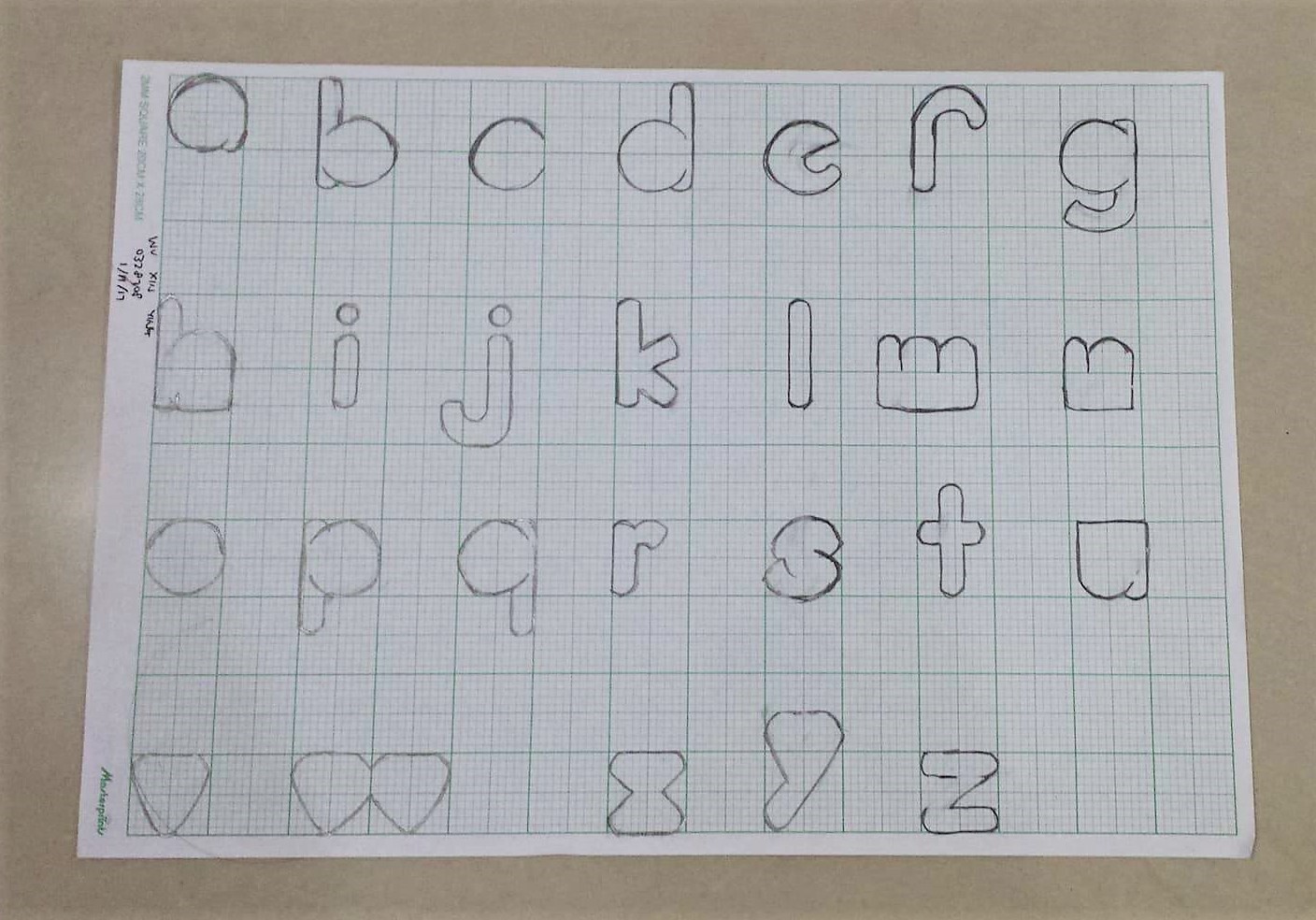
I started to design and sketch my own fonts on paper.
 |
| Fig.2 Sketches of font design |
 |
| Fig.3 Sketches of font design |
 |
| Fig.4 Sketches of font design |
After finalized my sketch, I started to digitize the font in Adobe Illustrator.
 |
| Fig.5 Digitized font in Adobe Illustrator |
After that, I transfer my font to Font Lab Studio.
 |
| Fig.6 My font in Font Lab Studio |
 |
| Fig.7 Adjust the kerning of my font |
Final Artwork
 |
| Fig.8 Final of my font design |
 |
| Fig.9 Final of my font design |
FEEDBACK
Week 9
For my font design, Mr Vinod told me to take the 10 fonts given as references and study the alphabet that I chose so that I can understand more about construction of a letter. Mr Shamsul told me to use lines and shapes to design the font instead of using pen tool. For my blog, Mr Shamsul said my titles are in different size and I need to adjust them so that it doesn't look messy. Next, Mr Shamsul also reminded me to include the book that I read in the blog. He also told me to include the lecture, feedback and reflection on week 5.
Week 10
For today class, Mr Vinod told me that my some of the stroke of my font design are not consistent and i need to do the adjustments so that they looks consistent. After that, Mr Vinod shows us the steps of how to import the font design in Illustrator to Font Lab Studio.
Week 11
After checking on my font design, Mr Vinod told me to include the cap height for my font and the capital letters should slightly lower than the assender. Moreover, Mr Shamsul reminded me that i should make sure that the stroke of my capital letter and smaller letter should be the same.
REFLECTION
Experience
When I'm sketching for my font design, I feel excited that I can design my own font that I like. But, after Mr Vinod checked my sketches, he told me that I cannot design a font simply and I need to refer to the references of the 10 fonts given and study the structure of alphabets. Moreover, Mr Vinod told me not to design a crazy font and start with a simple design.
Observation
I done many of research on the references that I chose and learnt about the structure of each alphabet. I had done my sketches with a simple design. When I trying to trace my font design in Adobe Illustrator, I faced a difficulty to trace the font as I using pen tool to trace them, Mr Shamsul had taught me a simple way to trace the font which is to use the stroke.
Findings
It is easier to design a font after taking the 10 fonts given as references as it helps us to understand more about the structure of each alphabet.
BOOK OF THE WEEK
Virtual typography by Matthias Hillner


From this book, I have learnt many different aspects of virtual typography and it also provides numerous examples of work by leading designers and also explain the reasons behind the design choices made. The examples shown include a range of screen-resolution works and diagrams, which when combined with detailed analysis in the text, create a fascinating insight into the world of virtual typography.
Virtual typography is consequently not simply a matter of extruding conventional fonts, letting type
bounce across the screen or making it spin randomly within three dimensions. It is about producing sensible solutions for conveying text messages gradually and effectively within media environments.


Comments
Post a Comment